M.I.R.A.G.E. - Multi-Input Reconnaissance and Guidance Environment (Heads-Up Display)
Application Notes
- Google API/Maps - A Google API key is required for the current implementation of the maps overlay for access to Google Maps. Getting an API key is currently beyond the scope of this document. Please see Google's documentation for details. There are plans to rewrite the maps code to support an open API.
Hardware
The following hardware is what was used to create the original helmet.
Embedded System Options
-
NVIDIA Jetson Orin Nano Developer Kit
Entry level Jetson for the OASIS project. Limited memory and no dedicated video encoders. Plenty of power otherwise.
Amazon: https://amzn.to/3TD0vAW
-
NVIDIA Jetson Orin NX 16GB
Power Jetson module that I'm currently using on my system. For my system, I'm using the NVIDIA Jetson Orin Nano kit board with an Orin NX 16GB module. Here are a couple of options that /should/ work but are personally untested.
-
Yahboom Jetson Orin NX Series 16GB Development Board Kit
Amazon: https://amzn.to/4aDuqQj
-
Waveshare Jetson Orin NX AI Development Kit, JETSON-ORIN-NX-DEV-KIT (16GB)
Waveshare: https://www.waveshare.com/product/jetson-orin-nx-16g-dev-kit.htm?sku=24222
-
reComputer J4012-Edge AI Device with NVIDIA Jetson Orin™ NX 16GB module
Seeed Studio: https://www.seeedstudio.com/reComputer-J4012-p-5586.html
-
-
Original System: NVIDIA Jetson Xavier NX (Discontinued)
Displays
-
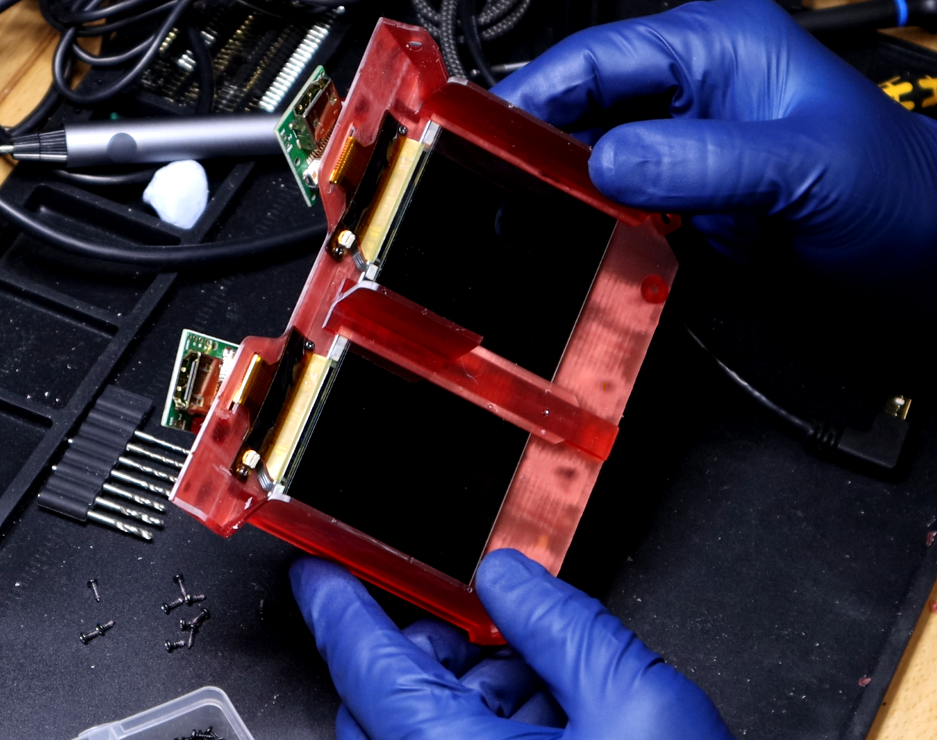
Wisecoco 2.9 Inch 2880*1440 2K Dual LCD Screen For VR AR Headset Windows Mixed Reality Display 120hz DP to MIPI Driver Board
AliExpress: https://s.click.aliexpress.com/e/_DeQX2lT
-
iWiner Mini DisplayPort to DisplayPort Cable, 6Ft
Amazon: https://amzn.to/43IxTL7
-
Alternative DisplayPort: Toptrend Mini Displayport Cable 6ft
Amazon: https://amzn.to/3vBOhR4
-
Duttek Mini DisplayPort Cable, 90 Degree
Amazon: https://amzn.to/3VJRHvN
Cameras
-
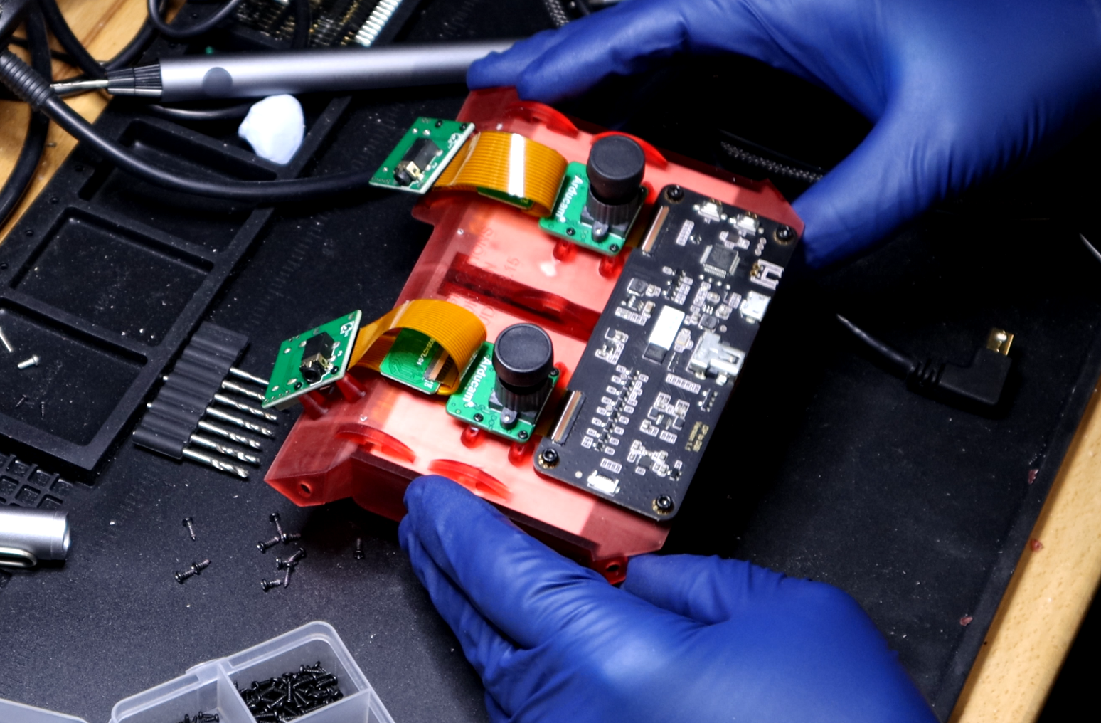
Arducam Mini 12.3MP HQ Camera - IMX477 (x2)
Amazon: https://amzn.to/4aw8vuA
-
Arducam CSI to HDMI Cable Extension Module (x2 sets)
Amazon: https://amzn.to/49orFS3
-
Monoprice - 124184 High Speed HDMI Cable - 3 Feet - Black (x2)
Amazon: https://amzn.to/49kXFqe
Installation Notes (Required Software)
After you've installed the OS on the Jetson, do this first.
- Update everything.
-
Install necessary packages.
sudo apt-get install cmake libudev-dev libxext-dev libwebp-dev libpulse-dev libvorbis-dev libjson-c-dev libsamplerate-dev libfreetype6-dev libcurl4-openssl-dev nvidia-jetpack libmosquitto-dev mosquitto libsndfile-dev libsdl2-dev libsdl2-ttf-dev libsdl2-image-dev libgd-dev -
Setup IO (Cameras, SPI)
sudo /opt/nvidia/jetson-io/jetson-io.py- Configure Jetson 40pin Header->Configure header pins manually->Enable 'spi1'->Save pin changes
- Configure Jetson 24pin CSI Connector->Configure for compatible hardware->Camera IMX219 Dual OR Camera IMX477 Dual OR Camera IMX477 Dual 4 Lane->Save pin changes
- Save and exit without rebooting
-
Install Jetson Inference (for Object Detection)
- (https://github.com/dusty-nv/jetson-inference/blob/master/docs/building-repo-2.md)
git clone https://github.com/dusty-nv/jetson-inferencecd jetson-inferencegit submodule update --initmkdir buildcd buildcmake ..make -j8sudo make install
-
Update user permissions.
- Add groups to user:
dialout
- Add groups to user:
Build MIRAGE
mkdir buildcd buildcmake ..make
MIRAGE Configuration
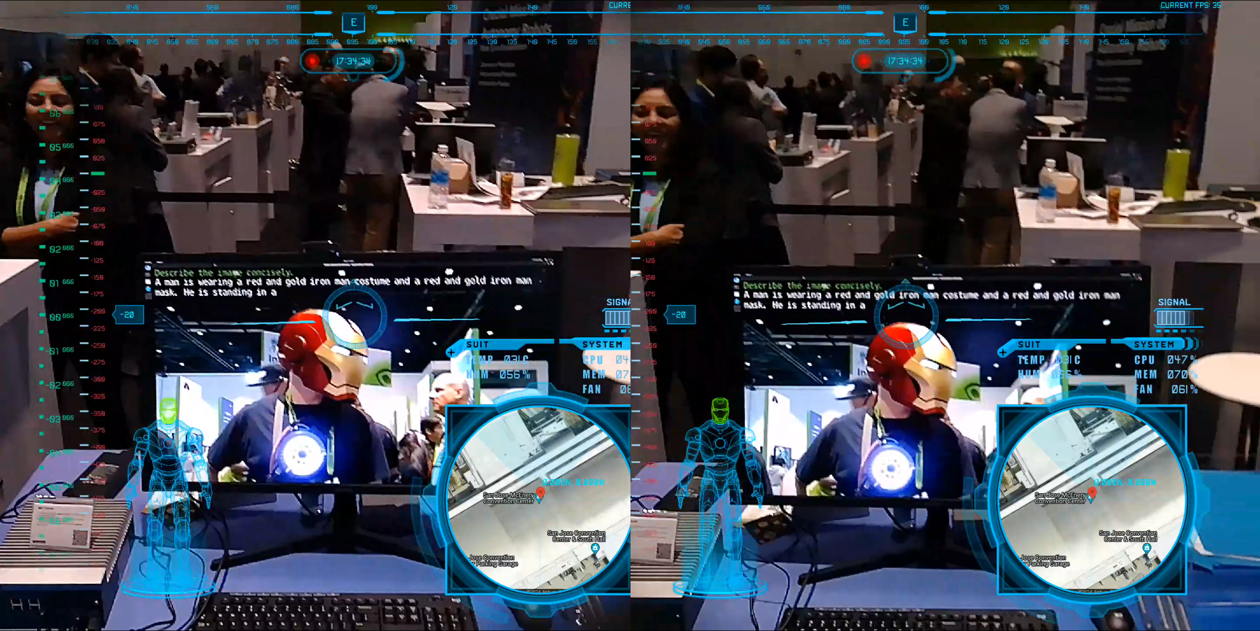
Welcome to the MIRAGE Configuration Guide! The MIRAGE UI is designed with flexibility at its core, allowing for a fully customizable experience through the config.json file. This powerful feature enables the integration of both static and animated graphics, text customization (including font and size), and the addition of unique elements positioned precisely with x/y coordinates and scaling. Moreover, UI elements can be effortlessly toggled on or off with the use of hotkeys and voice commands. While the current configuration offers a broad range of features, we anticipate further enhancements as more users engage with the system. Your feedback is crucial to perfecting the MIRAGE experience.
The config.json file uses JSON, a straightforward and versatile format, to organize the MIRAGE UI's settings. It's designed to be user-friendly, allowing for easy tweaks to the look and functionality of the UI. JSON structures the configuration details in a clear way, enabling you to adjust everything from screen layout to interactive features with minimal fuss. This approach combines accessibility with the flexibility needed for precise customization, making it manageable for both technical and less technical users alike.
Note: Due to some rapid coding, many of the settings are case sensitive. This may change in the future but you have been warned.
Global Configuration Section
Example Global Section
Below is an example of a Global section in the configuration file. This section outlines the primary settings for the MIRAGE UI, such as dimensions, paths for resources, and specific functionalities:
{
   "Global": {
      "Height": 1440,
      "Width": 1440,
      "Image Path": "ui_assets/mk2/",
      "Font Path": "ui_assets/fonts/",
      "Sound Path": "sound_assets/",
      "Stereo Offset": -90,
      "Wifi": "wlan0",
      "Invert Compass": true,
      "Stream Width": 800,
      "Stream Height": 400,
      "Stream Dest IP": "192.168.10.170",
      "Armor dest_x": 70,
      "Armor dest_y": 900,
      "Armor dest_w": 450,
      "Armor dest_h": 450,
      "Armor notice dest_x": 220,
      "Armor notice dest_y": 220,
      "Armor notice dest_w": 1000,
      "Armor notice dest_h": 1000,
      "Armor notice timeout": 5
   }
}
The "Global" section of the config.json file is your command center for setting up the foundational aspects of the MIRAGE UI. Here's a breakdown to help you configure the system to its maximum potential:
-
Height&Width: Set the default height and width (1440pixels) for each eye of the UI display. This establishes the canvas size on which all UI elements will be placed. -
Image Path: Designate the directory (ui_assets/mk2/) where UI images are stored. This path is critical for loading all graphical elements. -
Font Path: Specify the path (ui_assets/fonts/) to the directory containing font files. This allows for text customization across the UI. -
Sound Path: Determine where sound files are located (sound_assets/). Sounds can be triggered via MQTT messages. -
Stereo Offset: Adjust the stereo visual effect with a pixel (-90) offset. This can enhance the 3D experience for certain visuals. -
Wifi: Identify the network interface (e.g.,wlan0) used for wireless connections. This setting is essential for features that require querying the device. -
Invert Compass: Toggle the compass inversion (trueorfalse). Useful for adjusting compass behavior to match user preferences. Some devices act weird and require flipping. -
Stream Width&Stream Height: Configure the dimensions for network streaming content (800x400pixels). This resolution impacts device performance and network performance. -
Stream Dest IP: Set the destination IP address (192.168.10.170) for streaming content. This directs where the streamed data should be sent. -
Armor Placement: Customize the position and size of the armor display on the UI using
Armor dest_x,Armor dest_y,Armor dest_w, andArmor dest_h. This allows for precise control over how and where the armor status is shown. -
Armor Notice Placement & Timeout: Fine-tune the positioning and display duration of armor-related notifications with
Armor notice dest_x,Armor notice dest_y,Armor notice dest_w,Armor notice dest_h, andArmor notice timeout. These settings ensure critical information is prominently and timely displayed.
This section is foundational to the overall operation of the MIRAGE UI, providing essential settings that affect the display, performance, and functionality of the system. By customizing these parameters, you can tailor the MIRAGE experience to meet your specific needs and preferences.
Elements Section
The "Elements" section of the config.json file specifies the individual UI components that make up the MIRAGE interface. These elements can be anything from animated graphics, static images, and text labels to special components defined in the software. Each element is defined by a set of properties that determine its appearance, behavior, and placement within the UI.
Types of Elements
There are several types of elements you can include in the MIRAGE UI, each serving a unique function:
intro: Used for the animated introduction presented at application startup.special: Designates elements with specific, often dynamic, functionalities like altitude or pitch displays.static: Represents non-animated images or icons.text: Displays text on the UI.animated: For animated graphics created with animation sheets and a config json file.record-ui: This element dynamically changes its graphic to visually indicate the current recording and streaming status, using different images to represent not recording, recording, streaming, and both recording and streaming simultaneously.
Common Properties
Certain properties are shared across all (or most) types of elements, allowing for consistent customization and control:
type: Specifies the type of the element (e.g.,intro,special,static,text,animated).name: Used to provide a unique identifier for the element.file: The path to the file used by the element.dest_xanddest_y: The x and y coordinates where the element will be positioned on the UI.widthandheight: The dimensions of the element, allowing you to specify how wide and tall the element should be. This is particularly useful for resizing images or adjusting the area for text elements.angle: The rotation angle of the element. You can indicate a specific angle or there are two special arguments (this is specifically used for the the reticle):roll: Use the roll angle to indicate the angle of this element.opposite roll: Use the inverse roll angle to indicate the angle of the element. (-1.0 * roll)
layer: Determines the z-index or layer of the element, with higher numbers appearing above (or in front of) lower ones.hotkey: Designates a keyboard shortcut (e.g., "i") assigned to the element, enabling users to quickly enable or disable the element.enabled: A boolean (1or0) indicating whether the element is active and visible in the UI. This property allows for the dynamic toggling of elements, making it possible to show or hide them based on specific conditions or user interactions.
Type-Specific Properties
While many properties are universal, some are specific to certain element types, allowing for more detailed customization:
-
specialelement: In the MIRAGE UI, "special" elements are dynamic components designed to display real-time information and interactive data, each identified by a uniquename. Here’s a breakdown of these elements:altitude: Shows how high the user is, useful for applications needing elevation data.pitch: Displays the tilt angle of the device, crucial for maintaining orientation in navigation or remote-controlled operations.heading: Provides directional information, helping users to navigate by showing which way they’re facing relative to magnetic north.map: Offers near real-time mapping and location tracking via downloaded maps based on GPS info.wifi: Indicates the strength of the Wi-Fi connection, essential for activities that require internet access.detectVisualizes the detection of objects, alerting users to changes or important information in their environment.
-
textelement: This element brings dynamic textual content to the interface, ranging from static labels to real-time data displays. These elements are highly customizable, allowing for precise control over appearance and alignment. A unique aspect of text elements is their ability to interpret certain patterns, specifically strings enclosed in asterisks (e.g., STRING), as special values that the system dynamically replaces with actual data. Below is a detailed look at the properties specific to text elements:string: Determines the text displayed by the element. Strings encapsulated by asterisks represent special dynamic values that the system automatically updates with real-time information. Examples include*PITCH*,*FPS*,*COMPASS*,*LATLON*,*CPU*,*MEM*,*FAN*,*HELMTEMP*, and*HELMHUM*. These placeholders are replaced with actual data, such as current pitch angle, frames per second, compass direction, geographic coordinates, CPU usage, memory usage, fan speed, helmet temperature, and helmet humidity, respectively.font: Specifies the filename of the font file used for rendering the text. This allows for a variety of typographic styles to suit different UI themes.color: Sets the text color in RGBA format (e.g., "0xFF, 0xFF, 0xFF, 0xFF" for white). This property enables the text to stand out against the background and align with the UI's color scheme.size: Defines the font size of the text. Adjusting this property ensures that the text fits well within its designated area and remains legible across different devices and resolutions.halign: Specifies the horizontal alignment of the text within its container. Options include "left", "center", and "right", providing flexibility in how text is positioned and presented in the UI.
-
record-uielement: This element is a specialized component designed to visually indicate the state of recording and streaming activities. This element can change its appearance based on the current recording and streaming status, providing immediate visual feedback to the user. Here’s how it works and what each property means:file: The default graphic displayed when neither recording nor streaming is active. This serves as the baseline appearance.file_r: The graphic to display when recording is in progress. It visually differentiates from the non-recording state to alert users that recording has commenced.file_s: The graphic shown during streaming. This distinct visual cue informs users that streaming is currently active.file_rs: The graphic used when both recording and streaming are simultaneously active. This combination graphic ensures users are aware of both operations happening concurrently.
Components Section Documentation
The "Components" section of the config.json is dedicated to monitoring various parts of the armor, providing real-time status updates through a visually intuitive interface. Each entry in this section corresponds to a specific armor component, with details on how it should be visually represented under different conditions. Here’s a breakdown of the properties used to define each component:
{
"Components": [
    {
        "name": "Helmet",
        "device": "helmet",
        "base file": "FullBodyBlue/FullBody1.png",
        "online file": "FullBodyGreen/FullBody1Green.png",
        "warning file": "FullBodyYellow/FullBody1Yellow.png",
        "offline file": "FullBodyRed/FullBody1Red.png"
    }
}
Component Properties
name: The human-readable name of the armor component, intended for display purposes to make identification straightforward for the user.device: Specifies the MQTT topic that the component publishes to, serving as a unique identifier for data communication and monitoring.base file: The visual representation (typically in blue) of the component before any connection has been established, indicating the initial or standby state.online file: The file (usually green) shown once a connection to the component has been successfully made, signaling that the component is active and functioning.warning file: The file (commonly yellow) displayed when the component enters a warning state, such as overheating or low battery, prompting user attention to potential issues.offline file: The visual (typically red) used to indicate that the component has lost connection or is otherwise not communicating, alerting the user to a significant problem.


